Interior Design Move
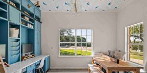
APOLLINA BAKER had every intention of papering the walls of her children’s craft room. Then reality set in. “Paint splatter and markers often end up all over the walls,” said the attorney turned design consultant in Dripping Springs, Texas. “We decided to install wallpaper on the ceiling only.” She chose Hygge & West’s Daydream, in which blue swallows swirl through cotton-candy clouds. “The room seems so much bigger and taller with the ‘sky,’” said Mrs. Baker.

That perception-altering effect of papering the ceiling—and its sheer exuberance—has design experts and DIYers looking up. “More of our customers are making a statement through wallpapering the ceiling,” said Elizabeth Rees, founder of Chasing Paper in Milwaukee, Wis. “It provides an unexpected design moment, something we’ve been looking to create this past year.”
Wrapping an entire room like a present skews maximalist, but you can add a more subtle dimension with textured neutrals like grasscloth. “People are starting to realize how much design potential has been hanging above their heads,” said Adam D’Agostine, chief marketing officer of A-Street Prints, another wallpaper company, in Randolph, Mass.
If your room otherwise features wall treatments with presence and a graphic rug, ignoring the topside is like wearing a ball gown without a tiara. “It’s a balance story,” said Karen B. Wolf, an interior designer in Short Hills, N.J. “With a patterned ceiling wallpaper, you tie the room together.”
PRO TIP
Ceiling wallpaper can trick the eye into ‘expanding’ or ‘shrinking’ a space. A dark, tight print can make a room feel cozier by bringing the ceiling down, while an airy, painterly motif can sneakily give the impression of greater volume.
For cohesion’s sake, paint walls and/or trim a shade you pull from the ceiling paper, suggested Dina Holland, an interior designer in Needham, Mass. A white perimeter looks unfinished, “like you started but got scared,” she said. In her children’s craft room, Mrs.
Baker painted the built-in desk and cabinets in Farrow & Ball’s Stone Blue, picking up the color of the birds overhead. Mrs. Holland gave a powder room (shown) personality by combining sparse fish graphics on the walls with a dense coral print above, varying scale to give the eye a place to rest.
A couple of precautions: A pattern that relies on an up/down orientation to make sense can create discord because you come at the ceiling from multiple directions, noted Cathy Purple Cherry, a designer in Annapolis, Md. And removal can be quite challenging.
But don’t let that dissuade you. Powder rooms in particular lend themselves to ceiling design, Mrs. Purple Cherry added, because visitors sit with little to do but check out the room, “and it’s kind of a peek-a-boo moment.”
Read Also: Mesopotamia Civilization Begins Review Where Credit Is Due
Copyright ©2021 Dow Jones & Company, Inc. All Rights Reserved. 87990cbe856818d5eddac44c7b1cdeb8


